The online service no longer reflects social norms
The online Newborn Registration Service used confusing language that led parents to input information that are not accurate to what the government needs. This has resulted in added cost and labour to fix these errors (also known as adjudications).
As we become more inclusive with gender neutral parental roles, a redesigned digital service is on its way to keep up with the times.
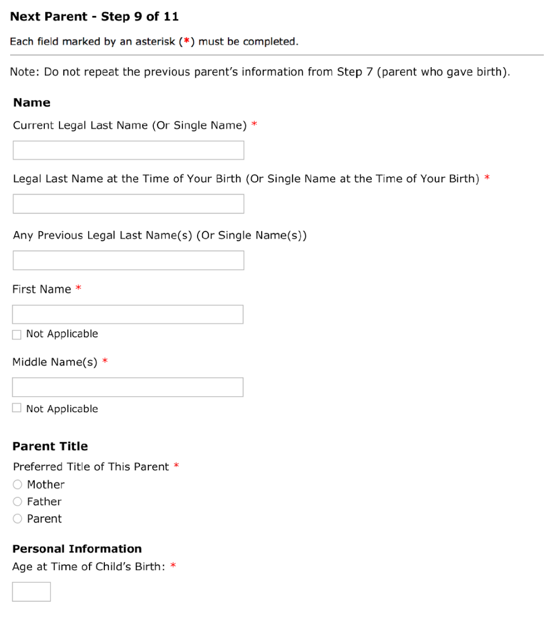
In the meantime, our team was tasked to modify parental language in the existing legacy system while the redesign is implemented.
Constraints included:
- we could only change text.
- we could not change any systems logic (for example we could not move questions from one page to another, remove or add another input field).
- we could not change policy or regulations.
- maintain gender neutral language.
Workshop to uncover system requirements
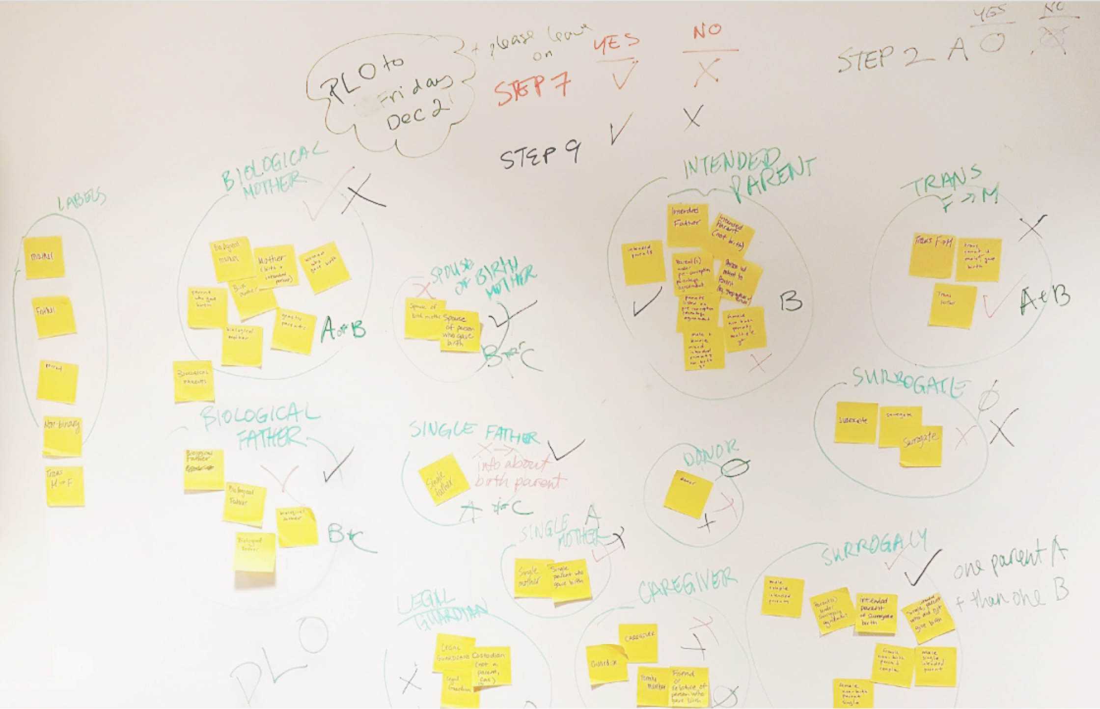
The purpose of the workshop was to:
- identify all users that go through the system (regardless of whether or not they are qualified to apply).
- go through each problematic screen and identify which form fields are intended for which users.
- brainstorm possible solutions.

Usability with adapted A/B test participants
Two versions of the prototypes were presented, alternating between A/B and B/A, to reduce bias on the first prototype presented.
There were a total of 14 participants.
Demographics
Small but significant improvements
The approved version was a hybrid that used the best elements from each prototype. Here are some design takeaways:
- using red text does not make people want to read
- left align input fields help people scan the content quicker
- providing more examples and explanations can be confusing
- the order of the questions matters
What was live

Proposed changes


What was live
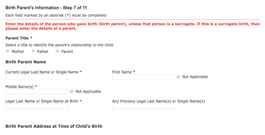
Proposed changes
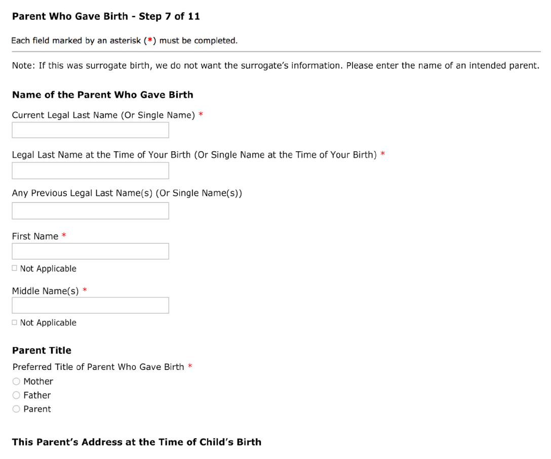

What was live
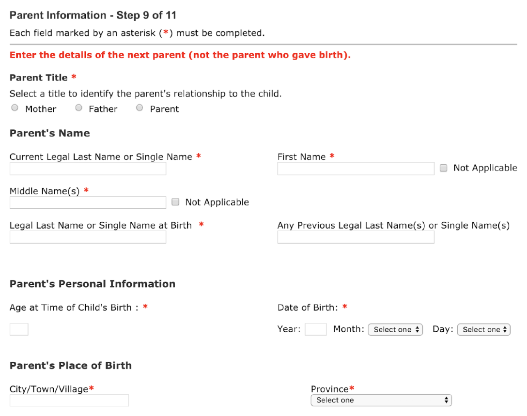
Proposed changes

Percentage of errors
Since we implemented the changes on March 31, 2019, the most noticeable improvement was the error of a male parent listed as the parent who gave birth, with a 56% reduction of errors in the three months since the changes went live.


Takeaways
By workshopping with ministry partners to test the prototypes, we were able to make inclusive changes and reduce the number of manual fixes required given the limited constraints.
In an ideal scenario, I would have liked to redesign the entire service from start to finish rather than only fix parts of the service. However, time and resources would have needed to be allocated.
Given our scope, we considered this a small win, and small wins are still improvements.

